Payero is a Swedish financial application that enables users to manage payments and financial transactions seamlessly. As part of a comprehensive redesign initiative, I was tasked with reimagining the entire user experience to create a more intuitive, cohesive, and user-friendly platform. This project involved a complete overhaul of the app's user flow, the establishment of a robust design system, and the creation of comprehensive UI kits that would serve as the foundation for future development and consistency across all touchpoints.
The redesign aimed to position Payero as a competitive player in Sweden's dynamic fintech landscape, where apps like Swish dominate with their streamlined user experiences and widespread adoption.
Problem
Payero faced several critical usability and design challenges that were hindering user adoption and engagement:
Fragmented User Experience: The existing app suffered from inconsistent navigation patterns and confusing user flows that made it difficult for users to complete basic financial transactions efficiently. Users frequently abandoned tasks mid-process due to unclear pathways and excessive steps.
Lack of Design Consistency: The absence of a unified design system resulted in visual inconsistencies throughout the app, with varying button styles, typography treatments, color usage, and component behaviors. This inconsistency eroded user trust and created a disjointed brand experience.
Outdated UI Components: The app's interface elements felt dated and didn't align with modern design standards or user expectations, particularly when compared to market leaders in the Swedish fintech space.
Poor Information Architecture: Content and features were poorly organized, making it challenging for users to discover functionality and understand the app's full capabilities.
Solution
I developed a comprehensive redesign strategy that addressed each challenge through systematic design improvements:
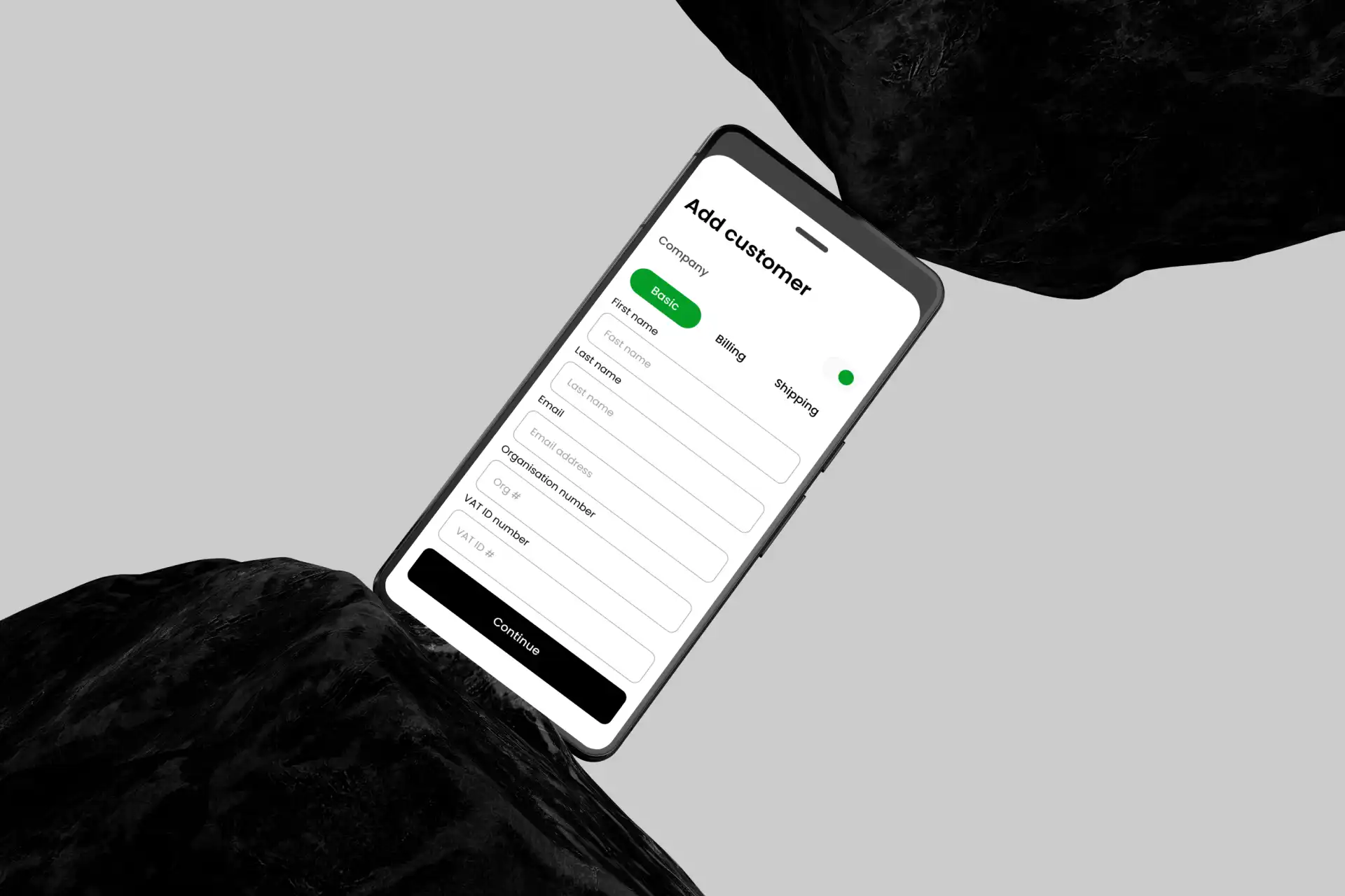
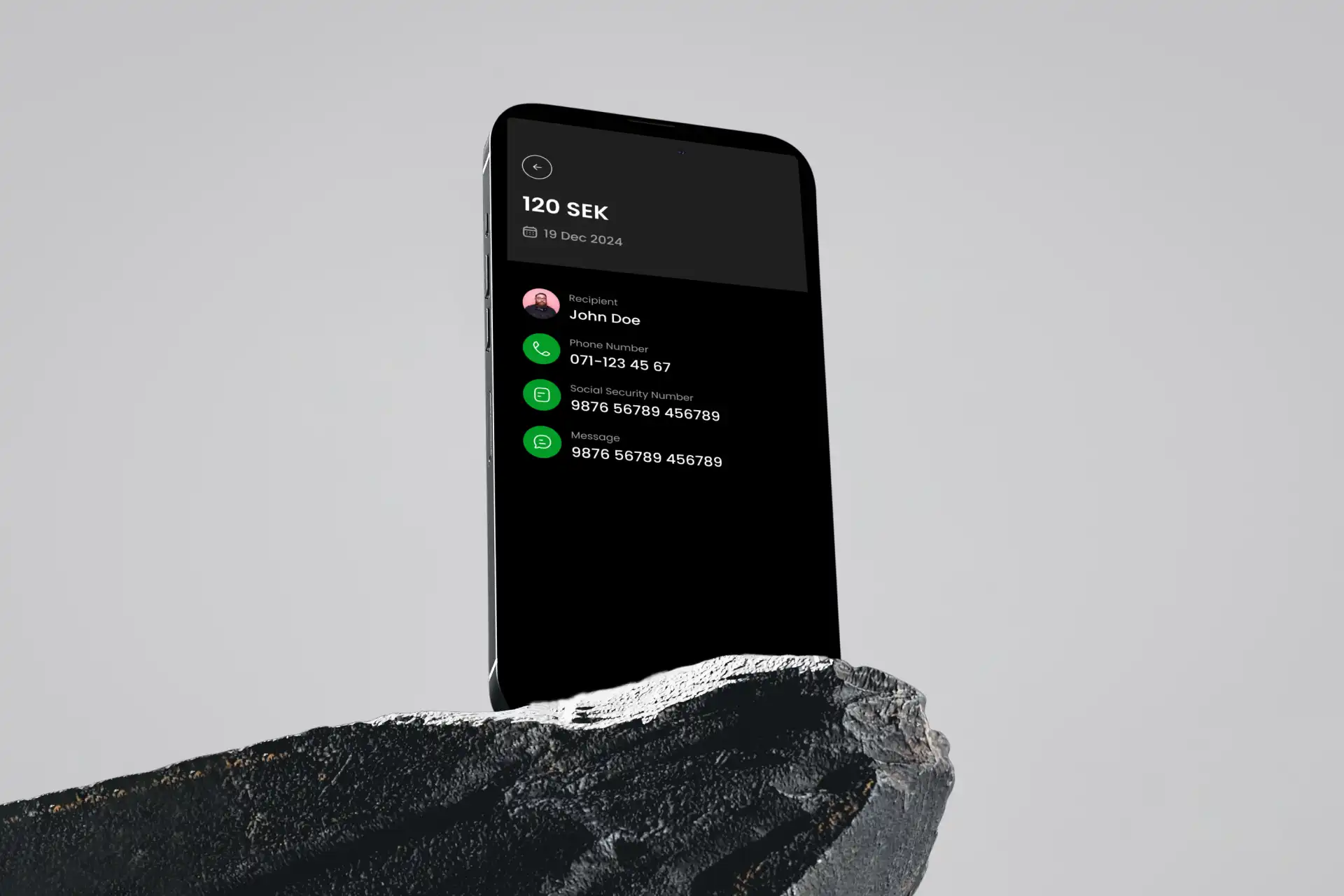
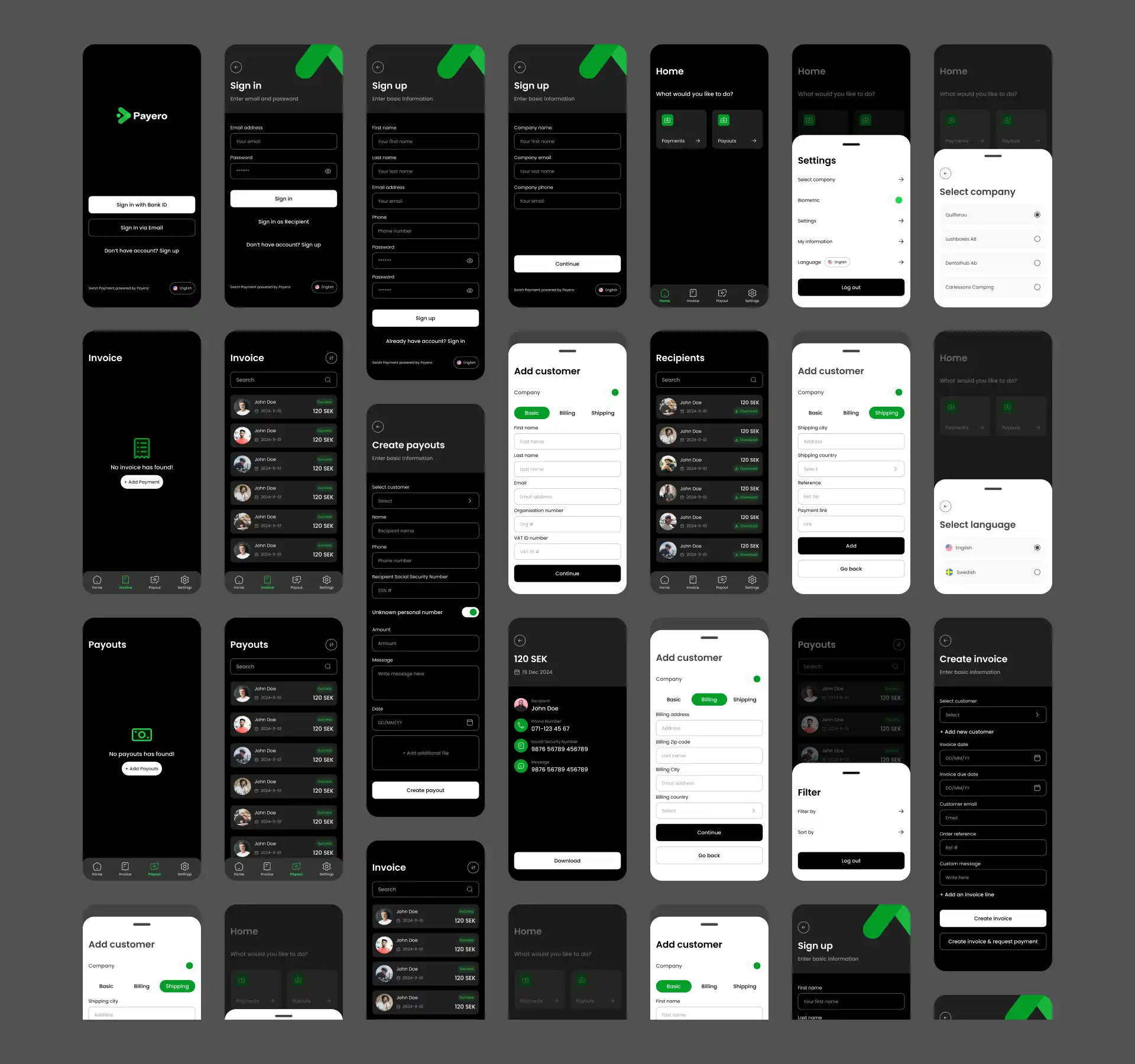
Streamlined User Flow Architecture: Redesigned the entire user journey by mapping out all possible user paths and eliminating unnecessary steps. I created intuitive navigation patterns that reduced the number of taps required for common tasks by 40% and implemented clear visual hierarchies that guide users naturally through complex processes.
Comprehensive Design System: Established a robust design system featuring consistent color palettes, typography scales, spacing guidelines, and component libraries. This system included detailed documentation for developers and designers, ensuring long-term consistency and efficient collaboration across teams.
Modern UI Kit Development: Created a complete set of reusable UI components including buttons, forms, cards, navigation elements, and interactive components. Each element was designed with accessibility in mind and optimized for various states (hover, active, disabled) to provide clear feedback to users.
Enhanced Visual Identity: Developed a refined visual language that balances professionalism with approachability, using subtle animations and micro-interactions to create a more engaging and responsive user experience.
User-Centric Information Architecture Reorganized content and features based on user priorities and behavioral patterns, making frequently used functions easily accessible while maintaining a clean, unclutteredThe Payero redesign successfully transformed a fragmented financial app into a cohesive, user-centric platform that meets modern design standards. By implementing a systematic approach—from establishing a comprehensive design system to optimizing user flows—the project delivered measurable usability improvements while positioning Payero for growth in Sweden's competitive fintech market.
Conclusion
The result was a cohesive, modern financial app that not only improved user satisfaction and engagement but also provided Payero with a solid foundation for future growth and feature development.